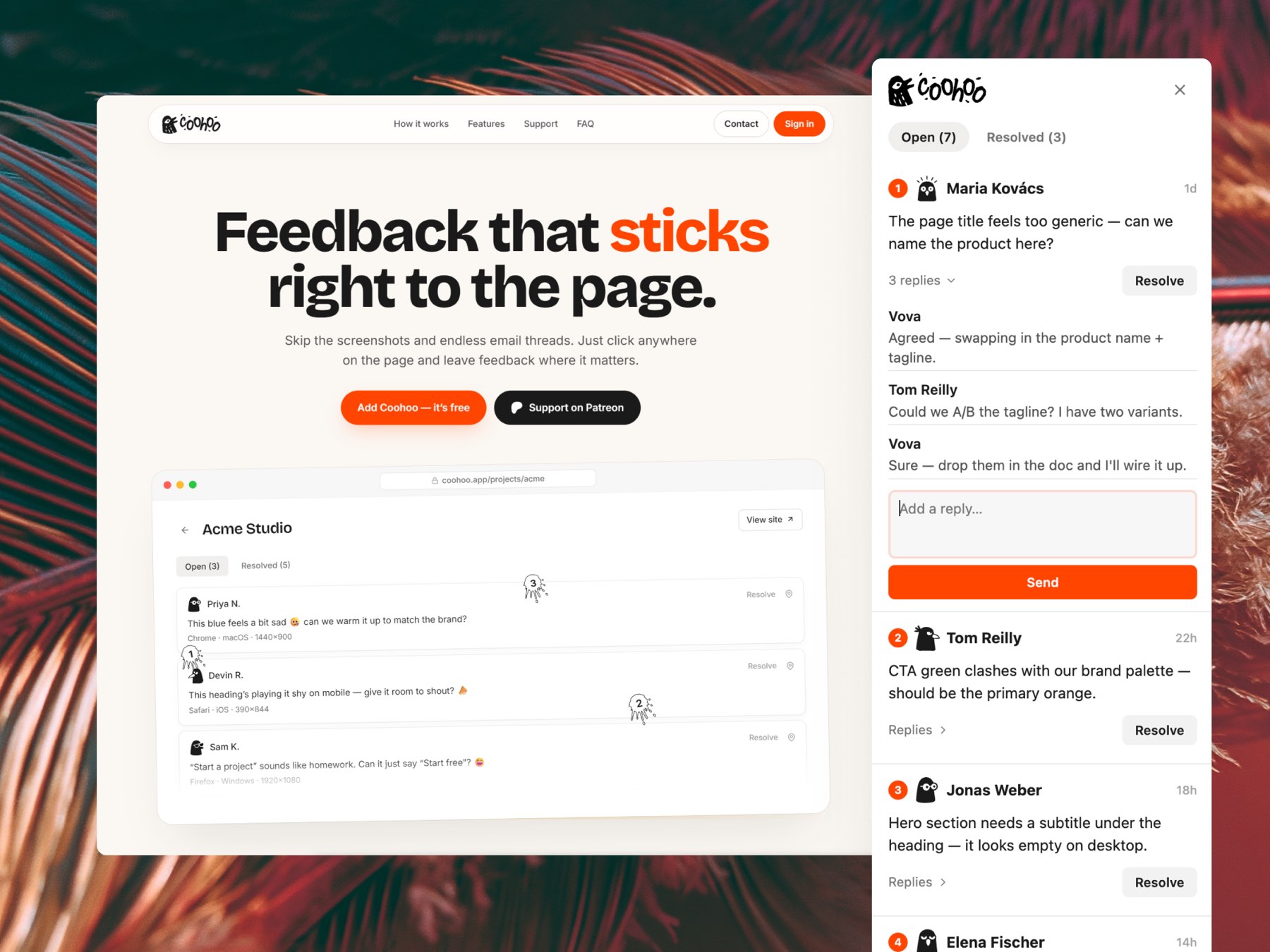
A visual feedback tool: your client clicks anywhere on a staging site and the comment pins to the exact element they meant: no screenshots, no accounts, no email threads. Designed, built and shipped solo.
Every web project ends the same way: the client sends a screenshot with a red circle, a Slack thread, two emails and a voice note. Half of it says "the button on that one page", and you spend the afternoon guessing which button, which page, which browser.
Tools for this exist. But they all want your client to create an account first, and clients don't create accounts. The feedback goes back to email, and the tool goes unused.
So I built the one I wanted on my own client work: one script tag on the staging site. The client clicks anywhere, types their name once, and the comment sticks to the element they actually meant.
Everything: product, brand, interface, widget, backend, launch. The product decisions that matter most are the ones that remove friction, and a few of them were hard to get right:
The brand is one scribbly bird and a hand-drawn wordmark: a note in the margin, because that's what the product is.
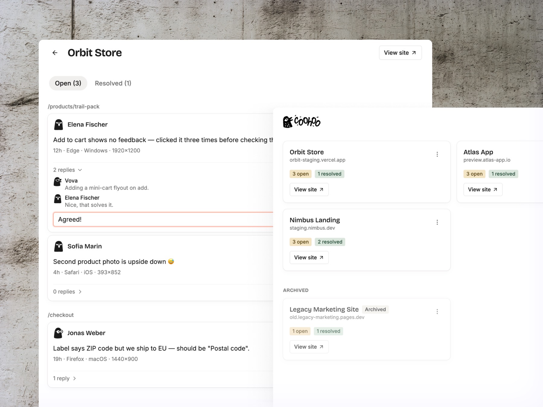
The dashboard: every pin from every staging site in one inbox. Reply, resolve, jump straight to the element on the page.
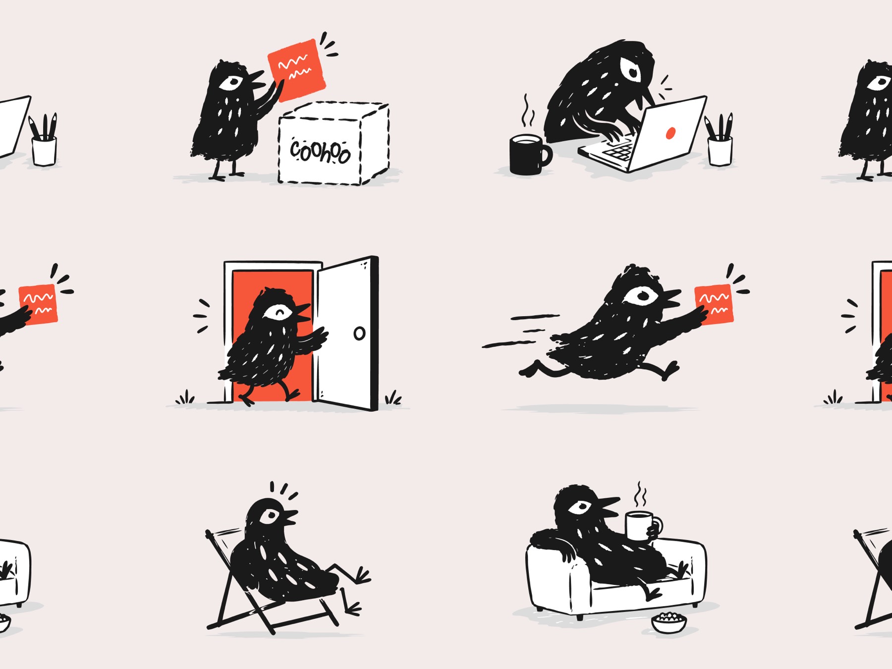
The bird carries the interface: empty states, onboarding, loading. Drawn once, used everywhere.
The hard part was the pins. A CSS selector alone breaks the moment a dev renames a class, so every pin stores three ways home: the selector, the click position as a percentage of the element, and a snippet of the element's text. Watching a comment survive a redesign and still point at the right button is the whole product in one interaction.
I also kept the honest trade-offs: the dashboard updates live over subscriptions, while the widget quietly polls every few seconds. Nobody reviewing a staging site needs more, and it keeps the embed tiny.
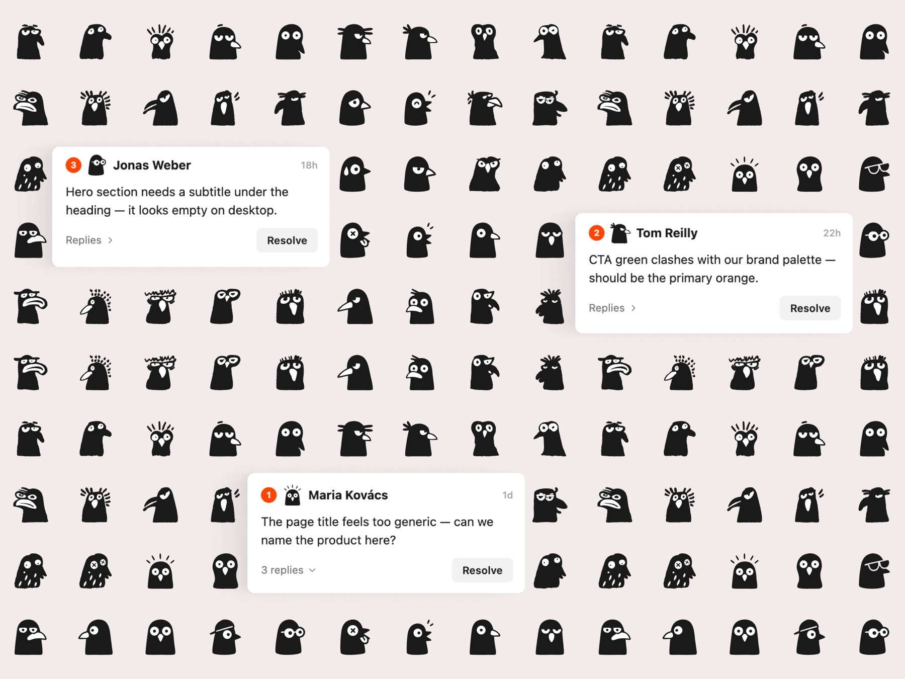
No accounts doesn't mean no identity: every reviewer gets a bird. One character, hundreds of moods.
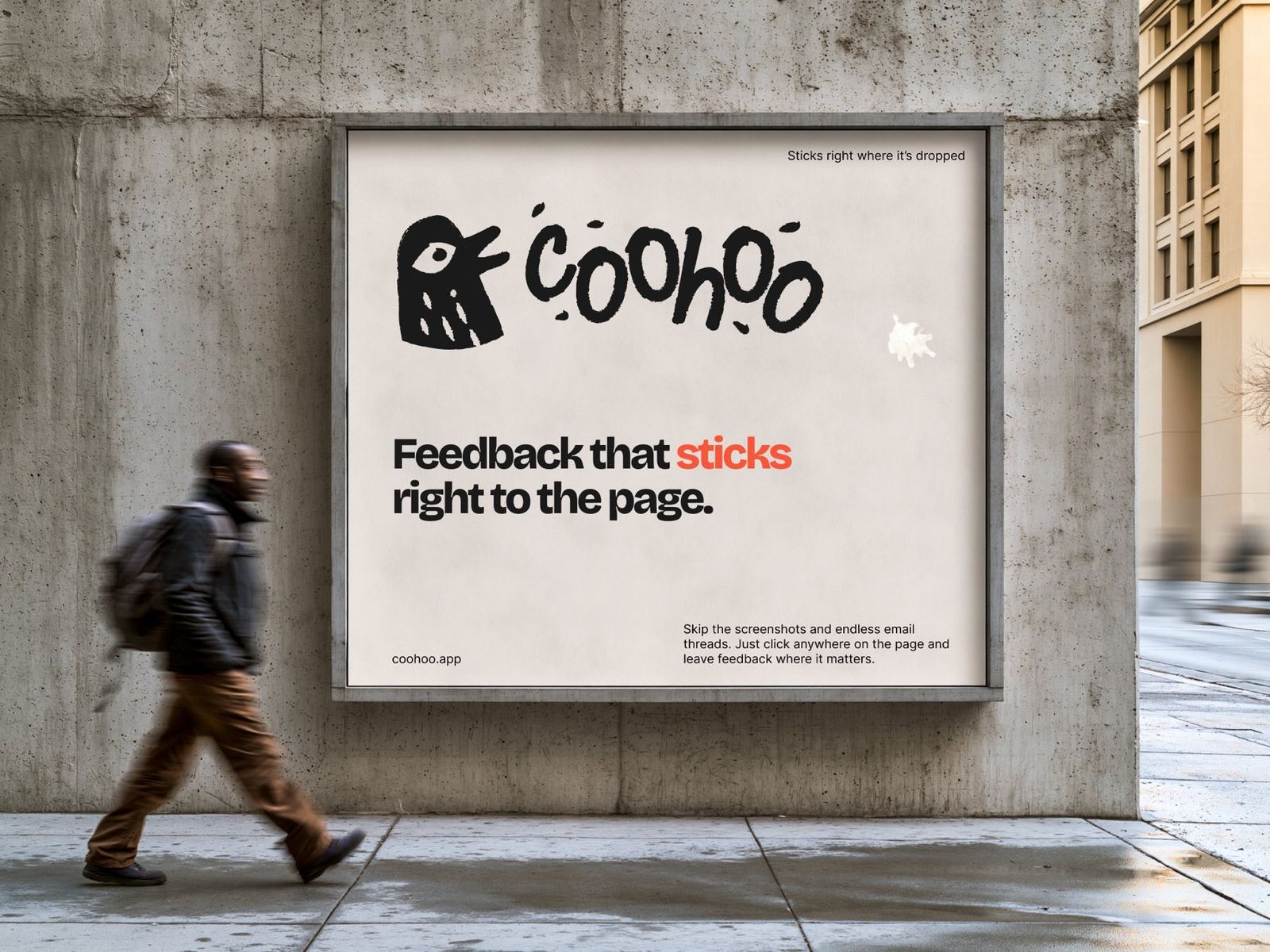
The brand holds up off-screen too: loud enough for a billboard, simple enough for a favicon.
Thirteen days from first commit to launch: spec first, then the widget, the backend, the dashboard, the hardening. Built the way I now build for clients: with AI in the loop, so a one-person team moves like a full one without skipping the hard parts. Live at coohoo.app, featured on Product Hunt.
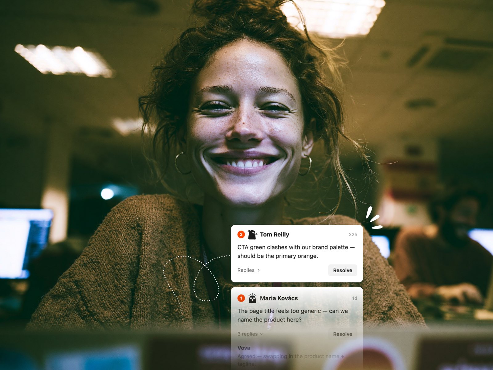
The point of all of it: the client just clicks, and the feedback lands where the work happens.